Nothing Phone (2) Design Unveiled: A Playful Approach to Smartphone Technology
The highly anticipated launch of the Nothing Phone (2) has created a buzz among tech enthusiasts, thanks to its intriguing teasers and leaks. With its transparent back design and unique features, the Phone (2) aims to inject a sense of fun into the world of technology. Nothing recently revealed the complete design of the smartphone ahead of the official launch event. Let’s take a closer look.
Introducing the Nothing Phone (2)
Renowned YouTuber Marques Brownlee, also known as MKBHD, shared an exciting Dope Tech video showcasing the design of the upcoming Phone (2). Nothing’s team also officially tweeted about the design changes, highlighting the differences compared to the previous Phone (1). The video primarily focuses on the new Glyph Interface without mentioning software, hardware specifications, or hands-on experiences.
Design Enhancements
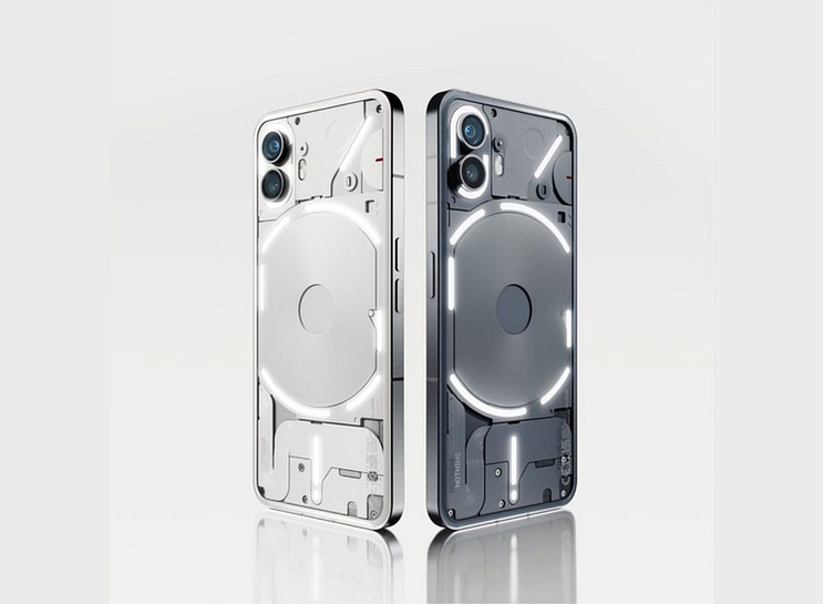
At first glance, the new gray colorway and subtly curved edges of the Nothing Phone (2) catch the eye. The phone will also be available in a white color option. While the display remains flat, the front punch-hole camera cutout is now centrally positioned.
The LED strip design has undergone an update. Instead of a continuous strip, Nothing has divided the LED strip around the wireless charging coil into six parts. The camera module features two separate LED strips, offering a total of 33 addressable lighting zones. Notably, the top right light strip surrounding the wireless charging coil showcases 16 customizable lighting zones.
Practical Glyph Lights
The Glyph lights in the Nothing Phone (2) serve multiple functions, enhancing practicality. They display volume levels, adapt to set timers, indicate notifications, and even show the progress of cab rides or online food deliveries (via Uber and Zomato, respectively). The bottom LED strip and the dot, resembling an exclamation icon, continue to function as charging indicators.
Emphasizing the Design
The unique design of the Nothing Phone (2) is meant to be showcased, especially when the phone is placed face down. Nothing counts on its distinctive aesthetic to attract attention. For comprehensive coverage of the Phone (2), visit Beebom. We would love to hear your thoughts on the design in the comments section below.